I'm sure you've seen many email advertisements in your inbox over recent years. Done well, they can promote a helpful product or service to existing and potential customers. Those people can click through to purchase, sign up for more information or whatever the call to action suggests.
You can earn revenue by selling banner ad space to relevant companies if you publish a newsletter.
And if you're a brand, you can run targeted campaigns to build brand awareness, drive traffic to your website, or sell a product/service via email banner ads so long as you choose newsletters with the right audience.
Banner ads can be confusing, so we've created a beginner's guide to help you plan and execute the best email banner ad campaigns possible.
What is an email banner ad?
Mailchimp describes email banner ads like this:
A banner ad is a type of digital advertising that focuses on images rather than text. Of course, there is still ad copy, but the image is one of the most important aspects because it can grab an audience's attention.
Think of it like the email version of a billboard.
This type of rectangular display advertising works because most people instinctively notice and respond to visual elements such as images and bold, colorful text or symbols. Also, our eyes are drawn to things inside frames, which banner ads usually provide.
Banner ads differ from a newsletter header (which acts like a brand introduction before the greeting) and an email signature banner or footer (which contains contact info and the unsubscribe link.) The newsletter writer or publisher sets those banners, whereas banner ads come from sponsors or advertisers.

Standard email banner ad sizes
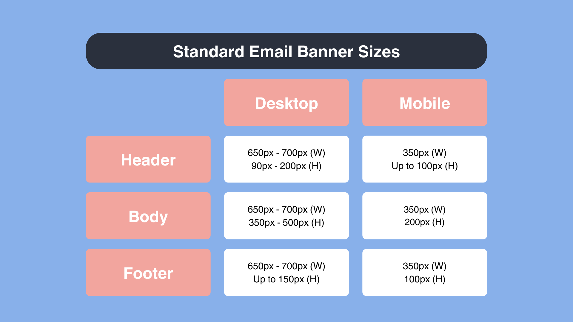
Email banner ads are usually rectangular (although occasionally you see them as squares, too.) For mobiles, you'd ideally size your banners between 320-385px (w) and 100-200px (h). On desktops, the ideals are 600-700px (w) and 90-500px (h), depending on where you place them on the page.
Banner ads are usually wider across the page —i.e., landscape, not portrait. Typically, headers and footers tend to be narrow (e.g., 650 x 200px), while body banner ads have more height (e.g., 650 x 500px).
Make sure you use a responsive design that automatically converts between laptop and desktop to give subscribers the best reading experience.
Email banner ad examples
Big Think

Many email newsletters have text-only messages from their sponsors. However, the Big Think newsletter uses banner ads to promote its top sponsors, in this case, 80,000 Hours.
Nutri NZ
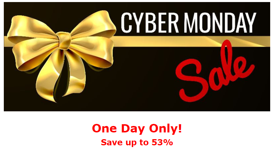
Banner ads can add color and variety to a newsletter if they're done well. This one from Nutri NZ has a simple design, eye-catching colors, and an easily read font. The time limit creates urgency, and 'Sale' makes readers feel like they'll win by getting a good deal.
Business Desk
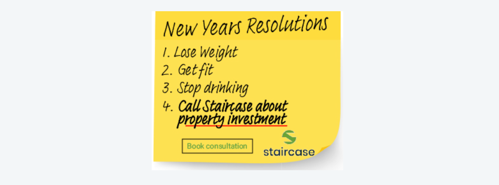
The yellow post-it note pops out in the middle of this New Year's newsletter. It works because it references the New Year goals habit that almost everyone has (whether we admit it or not.) The call to action draws your eye in (bold font, red underline) and includes a button to press before your resolution fades.
Advertiser tips
If you plan to use banner ads in your sponsorship campaigns, here's how you do it.
Identify your goals
Before you start, you should always know what you hope to achieve through your ad campaign. That's because your goal affects your ads' style, tone and content AND how you'll measure success after the campaign runs.
Do you want to:
- Sell a product or service?
- Promote a book or course?
- Build brand recognition and awareness?
- Attract newsletter readers into your paid community?
- Grow your own newsletter?
- Drive traffic to your website?
Banner ads work particularly well to build brand awareness by incorporating your logo, brand colors and slogan into the design.
Find newsletters in your niche
We wrote a whole article about finding newsletters in your niche.
In short, our ideas include:
- Browse the Web. Type 'category + newsletters' into your favorite search engine, e.g., "marketing newsletters".
- Ask colleagues. Your work colleagues, people you follow online and others in your industry will usually be able to recommend newsletters whose readers align with your target audience.
- Check out newsletter marketplaces. Many newsletter writers choose to list their newsletters on marketplaces. You can search through the categories, read the newsletter descriptions and contact the writers through the marketplace website.
- Use Reletter
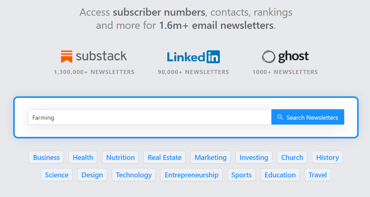
Naturally, we recommend Reletter as your first port of call to find relevant Substack, LinkedIn and Ghost newsletters in your niche.
Check their stats
Again, we've got an article to help: How to see how many subscribers a newsletter has
But to summarize:
- Try a web analytics tool like SimilarWeb
- Look on social media.
- Search for the newsletter's media kit.
- Ask the publisher.
Or bypass the hassle and head straight to Reletter.
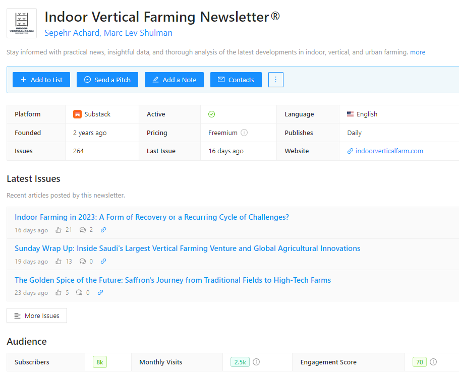
Reletter has data on every newsletter's audience numbers, traffic, and engagement, whether it's free or paid, issue frequency, and more. You'll also find links to the newsletter website, the latest issues and social media platforms.
Personalize your pitch
Research beyond the stats before you reach out to any newsletter publishers.
Read a few issues to understand the tone and style. That can help you decide whether the newsletter will fit your brand voice and values well and give you points to mention during your pitch.
It also lets you see the style of digital advertising they use. They may already use banner ads, in which case you can check out their preferred style. If the existing advertising copy is all text, your pitch could mention that you particularly want to use banner ads.
Finally, you'll understand their readers and whether they're the right audience for your brand.
Creators tend to roll their eyes when they get a generic pitch that's obviously been sent out to many publishers simultaneously. They're more likely to notice and respond to your pitch if you take the time to mention what you like about their newsletter (that's where reading the issues comes in) and how your product or brand would suit or solve a problem for their readers.
Reletter provides links to the latest issues of each newsletter in the database. Read them on the Reletter website or check out the original.
Design an eye-catching banner ad
There are three ways to achieve a stand-out email banner design.
- Hire a design company.
- Work with a freelancer (check out sites like Upwork or 99 Designs.)
- Use a template to create your own ad.
Canva has a heap of email banner design templates that you can modify and download.

Some of their designs are completely free. Others include paid elements or can only be used with a pro subscription.
Of course, Canva's not the only company offering banner ad templates. A quick web search will bring up plenty of possible links including sites like Adobe Express, Creatopy, Freepik and Desygner (to name a few.)
Use relevant images and maintain brand recognition by using brand colors, logos, etc. Prompt a response by including a call to action button or phrase.
Consider visual elements
Don't clutter the ad with too much information - let it be seen by creating space around the images and text. Consider using a solid background that allows text to stand out, not fade into a busy background.
Use an easily read font. Readers typically notice your ad for a second or two, so they need to take in the most relevant details at a glance.
Newsletter writer tips
Banner ads can work well in your newsletter, but there are a few things to keep in mind.
Only accept relevant advertisers
Your subscribers are more likely to accept ads in your newsletter if the brands have products and services they're interested in. So, don't consider other people's marketing campaigns unless they solve a problem or promote a deeply relevant brand to your audience.
That doesn't mean you can't think outside your niche. For example, a farming newsletter might run banners for a travel company offering specialized tours for farmers. And an animal-focused newsletter might include insurance ads if the company provided pet insurance policies.
Ensure the banner ad design is high-quality
You want the banner to stand out for the right reasons. Work with your sponsor to get an appealing design that enhances the look of your newsletter.
Consider placement
You'll charge more for display advertising than for text-only ads. Still, if you have too many ads in one issue, you risk readers developing ad blindness and perhaps even unsubscribing.
One or two well-placed banner ads will stand out, but not detract from your content. "Above the fold" (visible before the reader starts scrolling) but within the newsletter body is usually considered the best spot.
Final words
To sum up.
Banners are visual ads, rather like small billboards in a newsletter. Use them to drive sales, send customers to a website, or even get sign-ups for a newsletter.
Newsletter publishers:
Only accept sponsors with products that appeal to your specific audience. But be aware that having too many generic ads will likely turn your readers off. At best, they'll skip the ads; at worst, they'll unsubscribe.
Understand the value of banner ads to advertisers and customers. If you're unsure what to charge, research prices in the media kits of similar publications.
Only accept high-quality ads and place them carefully so readers see them but are not overwhelmed. Less is more when it comes to banner ads in newsletters.
Advertisers:
Create effective banner advertising by using an optimum-sized, rectangular banner.
Use an eye-catching image and easy-to-read font. Build brand awareness with company colors, logo, mottos etc.
Include a call to action and provide a clear link to a landing page.
Level up your outreach and find your best newsletter partners with Reletter. Sign up today.

