Do you want more newsletter subscribers?
Silly question! Of course you do. But you don't want just any new subscribers. You want new subscriptions from your target audience. So, what's the best way to attract and convert visitors into your ideal subscribers?
Create a newsletter landing page.
Think about it. How do people learn about your newsletter?
They might hear your podcast interviews. Or maybe read your guest blog post or those magazine articles you wrote. Maybe they heard you interviewed on the radio? Or they bought your book. Each of these is a golden opportunity to mention your newsletter.
A dedicated landing page gives you somewhere to send those potential subscribers whenever you make a call to action (CTA).
Table of Contents
What is a newsletter landing page?
Landing pages are single web pages with one dedicated purpose; in this case, to gather more newsletter readers. They demonstrate the value people will get (aka your value proposition) from your newsletter and make it super easy to sign up on the spot.
You can use your landing page to attract your target audience and, through your language, branding and value proposition, let others know your newsletter's not for them.
What do high converting landing pages need?
Great landing pages have several key elements. Put together, these create a winning formula to encourage website visitors to sign up.
1) Open with a compelling headline
GET SMARTER ABOUT CRYPTO! (Milk Road).
THERE'S A REASON 4M+ PROFESSIONALS READ OUR FREE NEWSLETTER. (Morning Brew)
An attention grabbing headline is a must-have on any well-designed landing page. It has just one job: to hook the reader and make them want to read on.

2) Follow up with a value proposition
Having grabbed their ideal reader's attention, the best newsletter landing pages immediately follow the headline with a couple of sentences that explain what the reader gets and why it's valuable.

Many value proposition sections also include information on when and how often newsletter subscribers can expect to get an email.
3) Prioritize clear, engaging design
An effective newsletter landing page is visually appealing and guides the viewer's eyes through the page. That means placing the text, images and buttons where readers expect them to be.
A logical order of landing page elements might be:
- Header - Logo, Menu, Headline and sub headline)
- Hero - above the fold; main image, value proposition, CTA
- Body - supporting text, archive links
- Social proof
- Second CTA
Visual elements matter
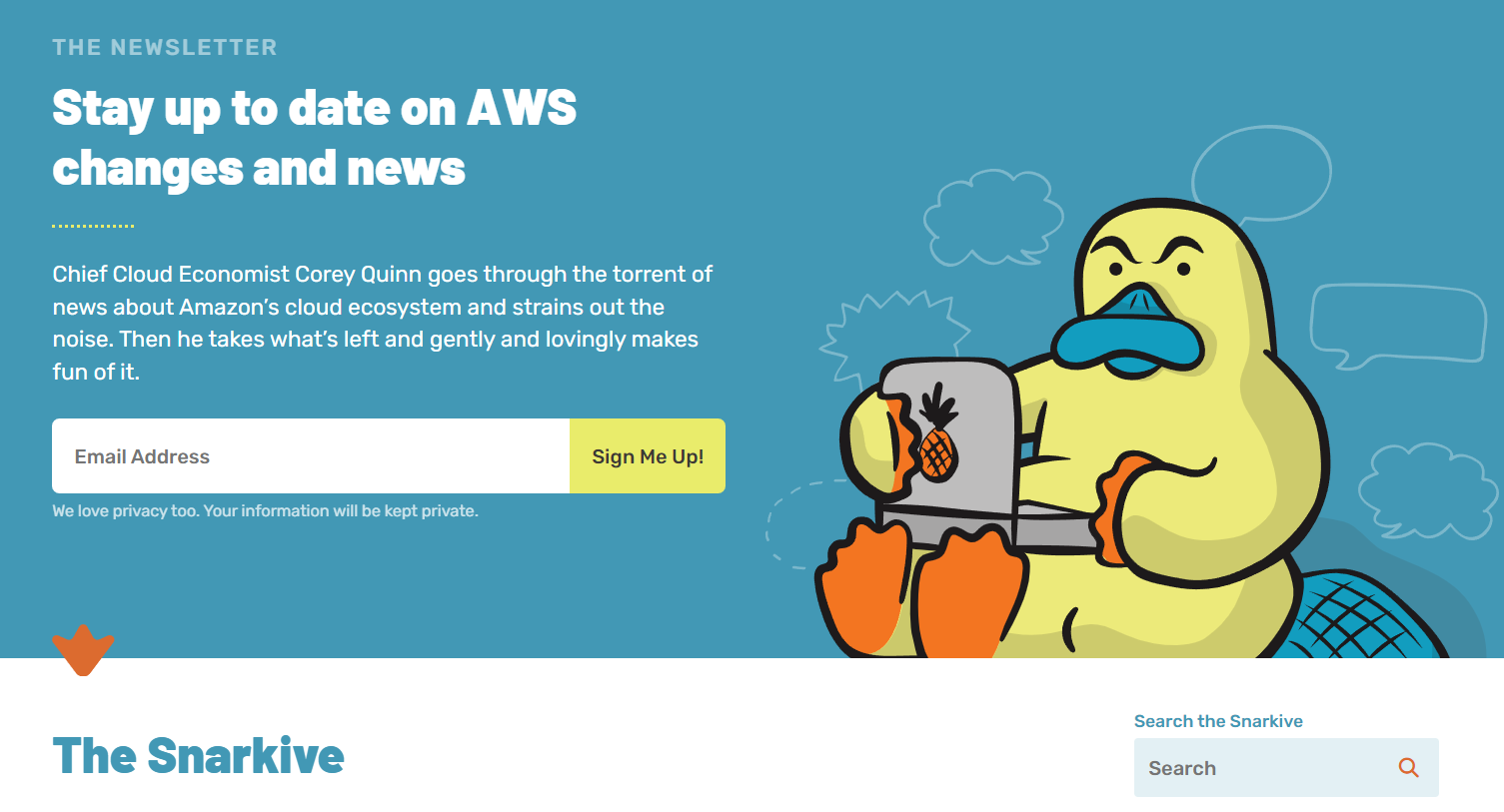
Use size, color and spacing to emphasize important information so viewers focus on it first. Make sure you leave empty space (aka whitespace or negative space) around the page elements so your landing page doesn't look cluttered.
Less is more when you're choosing colors, too. A general design rule is no more than 4 colors with one main color, a secondary color and one or two accent colors for emphasis.
Finally, choose a font that viewers can read at a glance and that match your brand's style. Use different font sizes, weights and spacing to show the hierarchy and make elements stand out. For example, your headline will be bigger and bolder than other words on the page.
Consider accessibility, too
Make your landing page user friendly, super-clear and easy to navigate and understand. Think about these factors:
- High-contrast colors (dark text on a light background or vice versa) and easy-to-read fonts.
- Links and buttons that are several words long and describe what happens next: e.g. “Subscribe to Our Newsletter” or “Learn About Our Content.”
- Images have alt text so that screen readers can describe them.
- Avoid auto-playing media or pop-ups (can be disorienting and make navigation difficult) or provide a way to easily stop or close them.
4) Make a clear call-to-action (CTA)
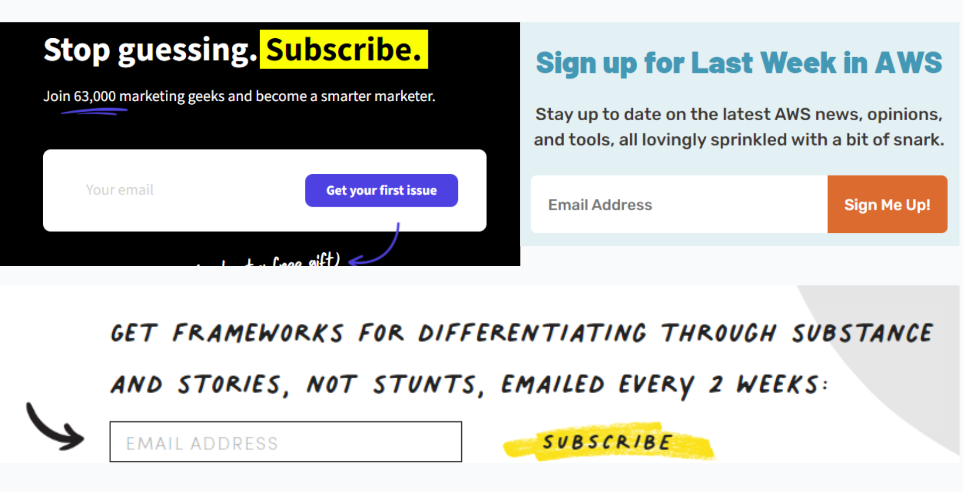
Every successful landing page needs a call to action. On a newsletter landing page that's your sign up section. The text is up to you, but keep it consistent with your brand and the overall page experience.
5) Include mobile responsiveness
The Global System for Mobile Communications (GSMA) 2023 report says that more people than ever are connecting to the internet through their mobile phones. But at the same time, there are still many people who prefer to use computers.
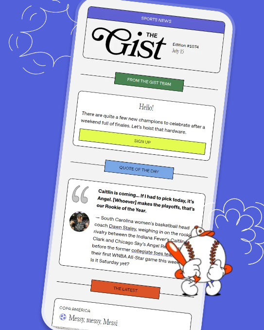
Your newsletter landing page really needs to cater to both groups. That means the design needs to work perfectly on both long narrow mobile screens and wider computer or laptop screens. Not to mention tablets, which fall somewhere in the middle.
When you choose a template, check that it is optimized for mobile responsiveness before you start building it.
6) Demonstrate social proof
A compelling newsletter landing page usually includes testimonials or comments as social proof that real people with your target audience's interests find your emails useful and engaging.
You might use a single quote, or several comments, and if you know you've got "big name" subscribers it's worthwhile popping them in, too.
Some landing pages make their social proof quotes static, while others use interactive elements called carrousels or testimonial sliders.
7) Use a simple sign-up form
The best newsletter sign ups don't make new subscribers jump through hoops. They keep information to a minimum on the landing page, just asking for a name and/or email address.

You might decide to add a CAPTCHA ((Completely Automated Public Turing test to tell Computers and Humans Apart), to keep spam bots out of your email list. A simple “I’m not a robot” box is easy to click and strikes a good balance between security and user experience.
10 newsletter landing page examples to inspire you
Let's examine some great landing page examples and see why they work.
Fix the News
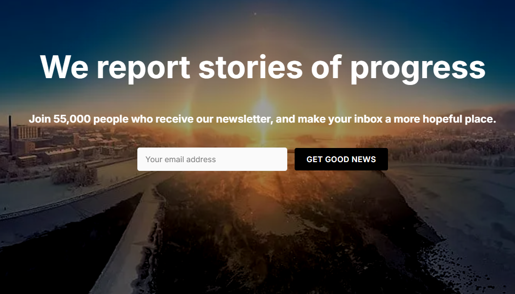
Fix the News is an Australian newsletter dedicated to reporting good news stories of progress towards saving people and the planet.
At first sight this landing page captures attention with a dramatic image. The bold headline (white on a dark background - very easy to read) and value proposition explain the newsletter's premise.
Scrolling down, you find links to many past issues and the landing page provides five clear links where viewers could act, including two sign up forms and three subscription links which bring up the choice of free and premium versions.
Jason Feifer
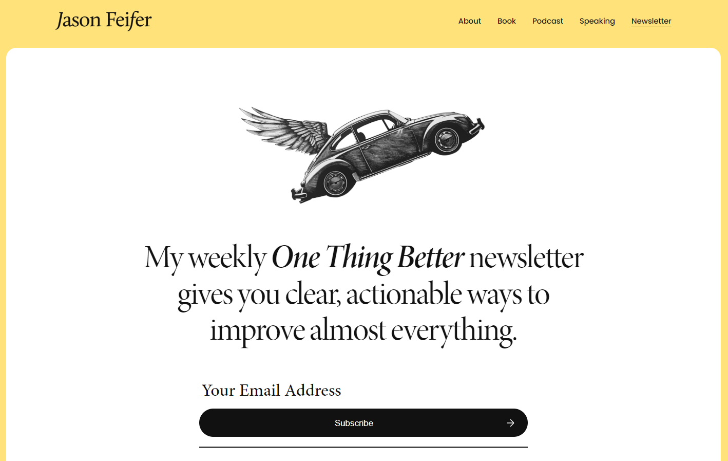
Each week Jason Feifer, editor in chief of Entrepreneur Magazine, shares one way his readers can use to feel more successful and satisfied in their work and personal lives in One Thing Better.
Jason's kept his newsletter page clean and uncluttered, with a black and white image, and plenty of white space framed in yellow. Notice how this landing page example combines the newsletter's headline and value proposition in one sentence, followed by a simple CTA.
Below the fold, the landing page continues with social proof (testimonials in a carousel, subscriber numbers) and links to previously published newsletters. Finally, I like how he highlights the final subscription form with a yellow background which flows from the frame and stands out from the white segments above.
Podcast Marketing Academy
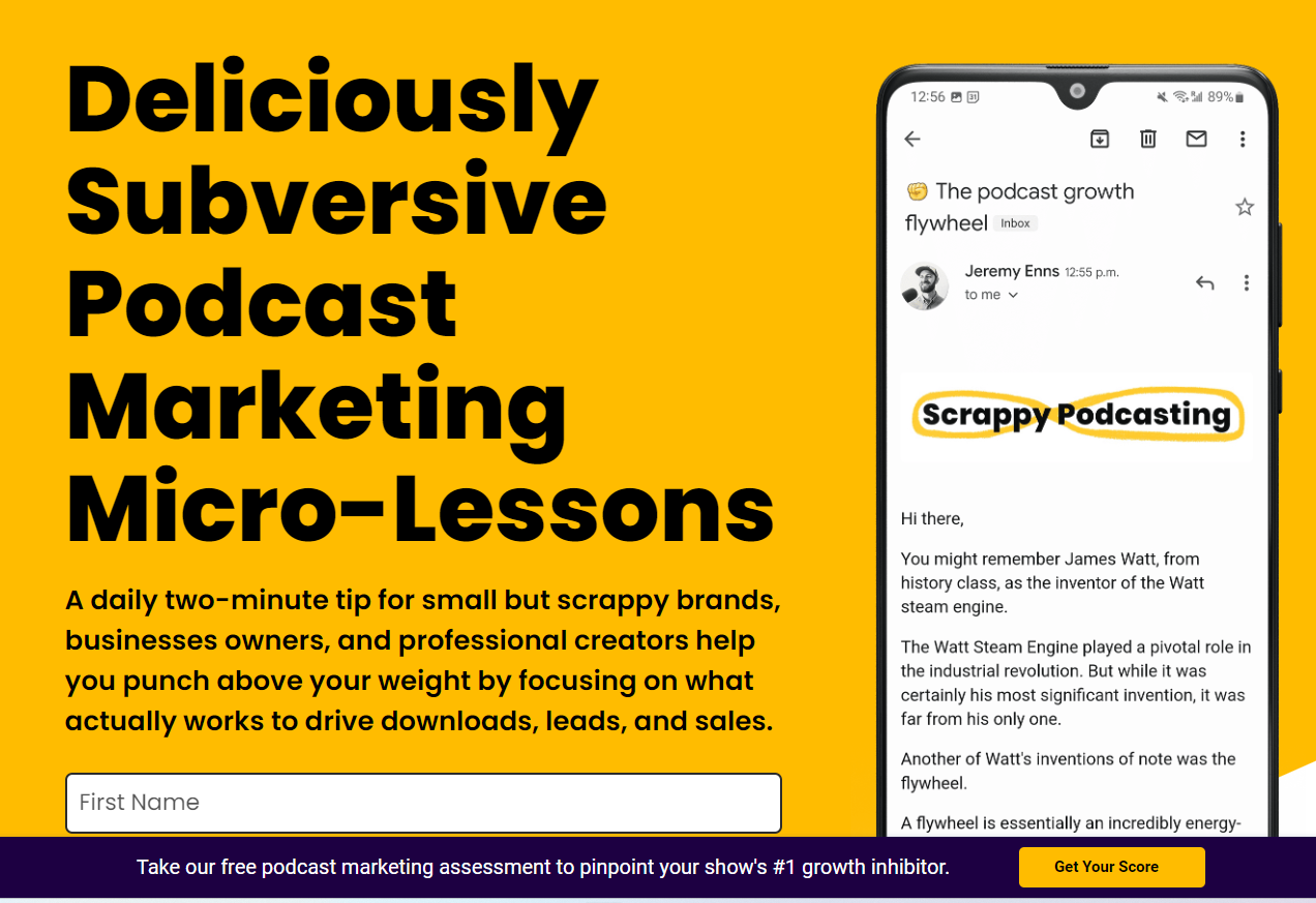
Jeremy Enns sends out daily stories and tips about creating and marketing podcasts in his Scrappy Podcasting newsletter. This landing page demonstrates good use of a easy-to-read dark font on a light, bright background, and shows all the 'what is it, who is it for and how often will I get it' information.
The image to the right demonstrates that the newsletter is mobile friendly and shows the newsletter's name. This landing page uses a pop-up feature, too, that sends interested podcasters to a podcast marketing assessment quiz.
Jay Acunzo
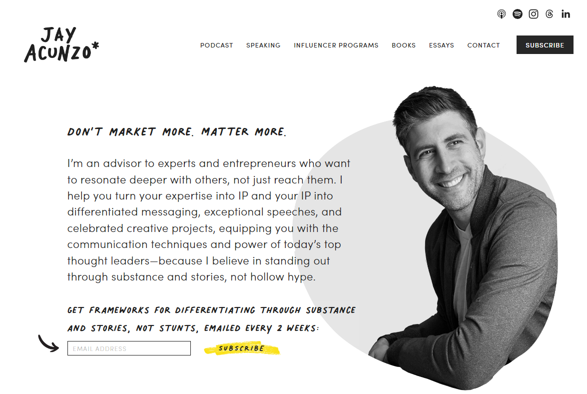
Most newsletter landing pages are quite short and to the point. This long form landing page, however, showcases the newsletter up top and Jay's other offerings further down the page.
Scroll through the full page and you'll find testimonials, videos, sketches and frameworks and CTAs. I've included it, even though it's not solely a newsletter landing page, because it's a terrific example of cohesive branding and demonstrating the individualistic style that makes Jay's work stand out to his target audience.
Fiction Writing with AI
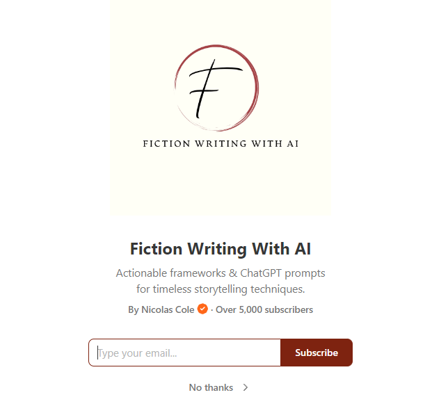
Newsletter websites like Substack automatically include a simple landing page. Substack calls it a Welcome Page, and it's where new visitors land from wherever they clicked your Substack link.
Here's a good example from Nicholas Cole's Fiction Writing With AI newsletter. A Substack landing page shows an image or GIF, title, author, description, reader numbers and a subscription form. It might also show up to three endorsements
Big Think
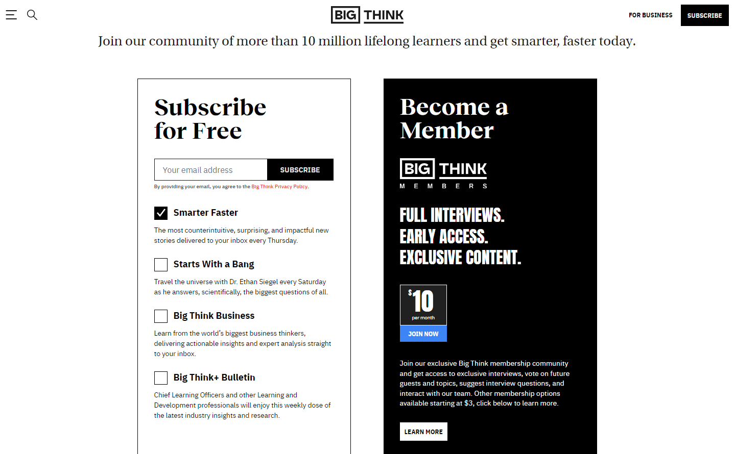
Big Think has a different approach to its newsletter sign up landing page.
This page presents you with two options: sign up to various publications for free or pay monthly to become a Big Think member. Notice how they've used contrast- black font/white background and white font/black background - on the two options, and how the membership option stands out with bold capitals and a color pop on the "Join Now" button.
Nate Kadlac
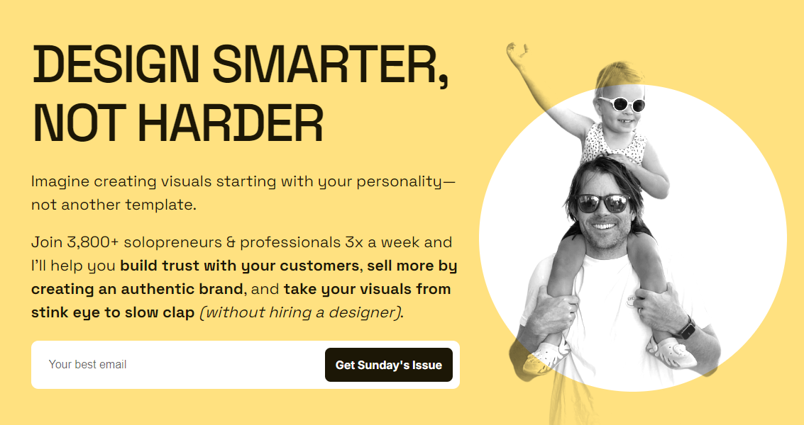
Nate Kadlac makes a living from design, so you'd expect him to have a beautifully designed, effective newsletter landing page.
Indeed, here's how he uses a few key elements make this page pop.
- The big bold headline stands out and includes a clear value proposition; his ideal reader wants to create their own visually appealing, personality-driven images and pages that don't look like they've come from a template.
- The image gives viewers a glimpse into Nate's personality and values. The simple, image on a white circle balances the text-heavy column on the other side.
- Names his ideal audience (solopreneurs and professionals) and details what you can expect to get and how often.
- Unambiguous sign up form
And that's just above the fold (i.e., what viewers see before scrolling.)
Sounds Profitable
The Sounds Profitable presents a very different, but still effective newsletter landing page from the example above. It's also another example of a landing page that showcases several offerings.
This landing page includes a dark background and light font. Rather than showing the author, the podcaster image represents the Sounds Profitable target audience, i.e., podcasters. All the usual information's there, and they've made clever use of color pops to emphasize the CTAs because orange and blue are complementary colors (opposites on the color wheel.)
Interestingly, below the fold the background is white, which makes the newsletter subscription form stand out even more.
PodNews
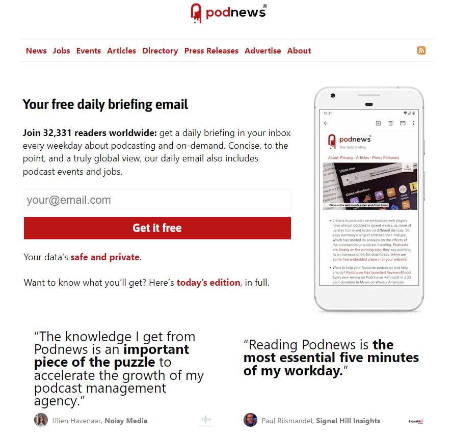
Podnews is a daily round up of news, events, announcements and movements in the podcasting world.
It's landing page cleverly reflects the layout, and branding of the actual newsletter by using the same font and that very distinctive red. Scroll down and you'll find social proof in the form of the logos of gold and silver subscribers plus links to past issues and podcasts.
Copy Revival
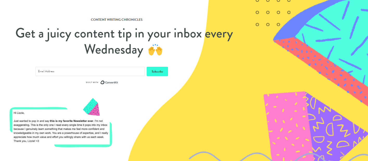
Finally, I couldn't leave out the Content Writing Chronicles newsletter landing page because the design is light, bright and fresh from top to toe.
Interestingly, this landing page includes all the necessary info (who, what, where and when) in the headline and testimonial. Scroll down, and you find a brief description of Lizzie Davey's expertise and the value she offers in this newsletter.
The only thing I'd change on this newsletter landing page is the font size because I have to work hard to read such small text.
How to create a newsletter landing page
Compelling landing pages don't just happen. It doesn't matter whether you're starting from scratch or using a landing page builder, you'll have to make lots of decisions around color choices, images, font and, of course, what you actually say.
Draft your copy
Take time to clarify your ideas. The goal of your landing page is to attract your ideal readers, who will benefit from your expertise. Ideally, they go on to buy your products and become enthusiastic advocates for your brand.
First, consider:
- What is your newsletter's purpose?
- Who is your audience?
- What value does the newsletter offer them?
- How often do you send it?
- What writing style do you use?
- What elements of your brand should transfer to the landing page?
- What's your tone or voice: Clever? Witty? Straightforward? Cute?
Once you've answered these questions, you have three ways to produce your draft.
Write the words yourself
That first draft won't be pretty; no matter the idea is to get your ideas down on paper (or screen.) Then distil your sentences down till they convey those key messages: who, why, what and when.
Writing a draft isn't easy, but Ann Handley (Marketing Profs, Everybody Writes) says
The first draft is the thinking draft. That's where you need to be fully present. On board. Just you and your glorious ideas.
Once you've nailed the message, start playing with the words to produce crystal clear value sentences, headline and opt-in form.
I guarantee that most of the beautifully crafted landing page examples above took hours - maybe even days to write. Headlines alone can take enormous effort. Sometimes your first headline is great, but more often than not you might write 30 or more versions before you nail it.
Hire an expert
Consider consulting a specialist copywriter.
Give them your answers to the above questions and let them produce the text for your landing page. This option may cost you more money upfront, but will likely save you time and effort and produce the quality words you need.
Use AI
You could also put those answers into a prompt and let an AI service produce the copy for you. There are loads to choose from. Read our Newsletter Generator article for five AI options to get you started.
Nail your design
Again, you have three options: do it yourself, hire an expert designer or use a landing page builder.
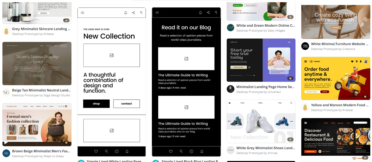
You can find free landing page templates on design platforms like Canva. And if your email service provider (ESP) includes a landing page builder, they'll have templates available, too.
Design is where you decide on all the four essential elements that we discussed above: color, images, font and placement.
Choose a platform
Your newsletter landing page can live on your business website. Many of our newsletter landing page examples are part of larger websites.
However, if you don't have your own website, ESPs like MailerLite, Mailchimp and ConvertKit let you design your page using their landing page templates and host it right on their platform.
Optimize for all devices
If you want to encourage visitors, you'll ensure that they have a great experience with your landing page no matter what sort of device they're using to read it.
That means making sure your landing page is user friendly on mobiles, tablets, laptops and computer screens.
A/B test
A/B testing (or split testing) lets you compare two versions of your newsletter landing page to see which one performs better. You show Version A to one half of your landing page visitors and Version B to the rest. Then you analyze the results to see which variation is more effective.
It's best to test one element at a time, and run the test for long enough to get statistically significant results.
For example, you might love two of the headlines you came up with, but which one will attract and convert visitors the best?
In this case, create a split test where Version A uses one headline and the other headline goes into Version B. Track user behavior to see which version performs best over a designated time period. Then, choose the version that generates the most newsletter signups.
Monitor performance
Of course, the work doesn't end when your landing page goes live.
You'll need to monitor how it performs to understand how well it's working and what you might need to tweak or split test. Key metrics include conversion rates, bounce rates, and time on page.
Final thoughts
Landing pages are essential elements in your marketing strategy.
The entire page has one job: to encourage readers to sign up. Remember, it needs a compelling headline, to offer clear value to your ideal customers and have a straightforward subscription process.
When your newsletter landing page is up and running, you'll want to entice visitors to it whenever possible. One way to grow your newsletter is by advertising in other newsletters in your niche.
That's where Reletter comes in. Search our database to find your best opportunities.

